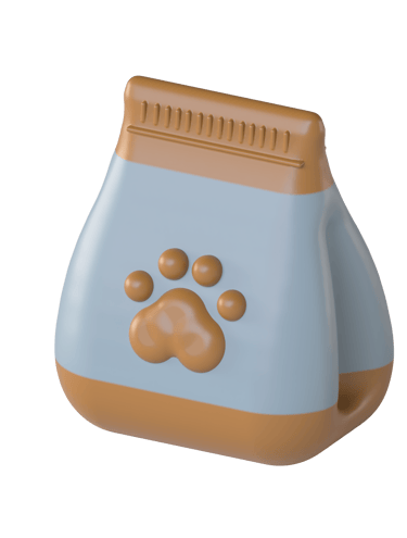
Feed My Paws
Crafting a fun and visually engaging shopping experience for pet owners
I redesigned the Feed My Paws e-commerce site as a side project to improve its cluttered navigation and outdated visuals. Through user interviews and a card sorting exercise, I simplified the information architecture and made it easier for pet owners to browse and shop.
With no prior design experience, I began by following safe and conventional layouts. As I grew more confident with design tools, I refined the interface and took a bolder approach. The final design features vibrant visuals, dynamic elements, and large text, creating a distinctive and enjoyable experience that reflects the fun and excitement pets get from their treats.
Revitalising Feed My Paws: A Bold New Look
TL;DR

Feed My Paws offers a wide array of homemade, nutritious treats catering to a diverse range of pets, including dogs, cats, rabbits, guinea pigs, hamsters, and chinchillas. Their unique focus on small animals sets them apart from competitors who primarily cater to dogs and cats. However, this resulted in an overloaded product navigation menu, making it difficult for shoppers to find treats.
Additionally, the site's original design featured outdated visuals such as low-resolution media, diminishing its visual appeal. This set the stage for a much-needed redesign to transform the site into a user-friendly, visually appealing space that pet owners could enjoy shopping on as much as their pets would enjoy the treats.
Elevating the shopping experience at Feed My Paws
About


Surveying the Market
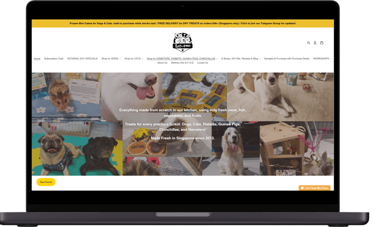
Feed My Paws: Global navigation menu appears overcrowded with options. The splash screen is composed of low resolution pet images with a text overlay that is difficult to read.
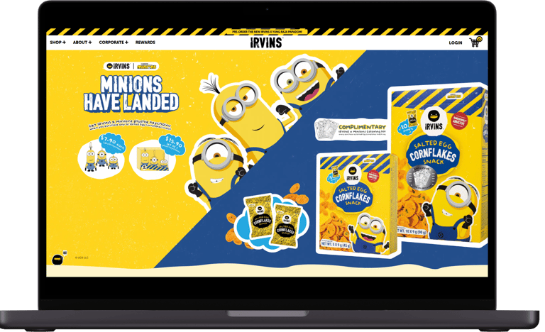
Irvins: Clean navigation menu complemented by bold visuals and vibrant colors, creating an engaging and intuitive shopping experience for users.
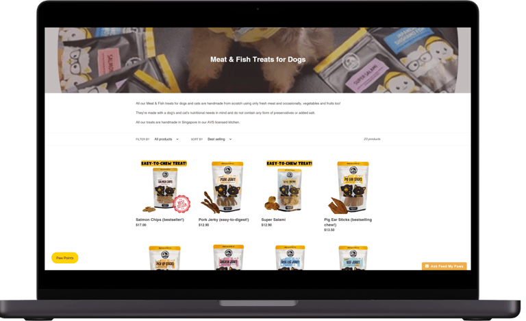
Feed My Paws: The product names are fun, but the photos are slightly inconsistent in appearance. There is also no 'Add to Cart' button, requiring users to take an extra step to click into the product.

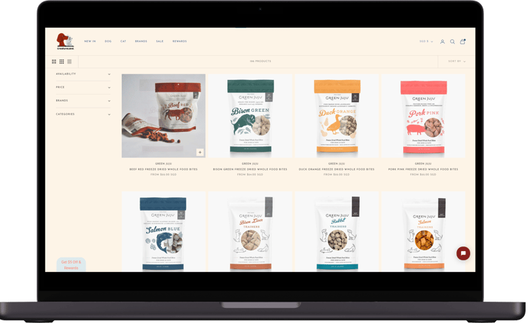
Creatureland: Clear and bright product photos complemented by easy-to-use filters. Hovering over an item reveals an alternate product photo and a '+' button to easily add items to cart.
I began by exploring the e-commerce industry and other pet product websites. By comparing key factors such as visual appeal, navigational ease, and product categorisation, I identified critical areas for improvement to create a more streamlined and visually engaging shopping experience.


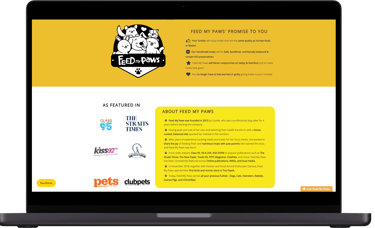
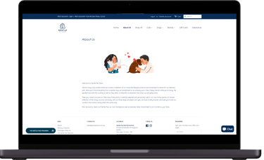
Feed My Paws: The 'About Us' page lacks proper layout alignment, uses inconsistent colors, and comes across as visually unpolished.
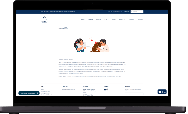
Gentle Pet Store: Clean and inviting layout with high readability, enhanced by cute graphics that captures the brand's friendly and caring ethos.
Shoppers' Desires
To uncover insights into pet owners’ online shopping habits, I interviewed 12 pet owners with a focus on the following key research objectives:
To understand pet owners' needs, preferences, and pain points pertaining to purchasing treats, cakes, and supplements for their pets online.
To gather feedback on their current experiences shopping for pet products online.
To explore their expectations for website organisation, product presentation, and the availability of information.
Q: How do you shop for pet products online?
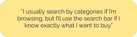
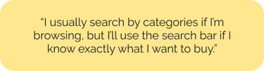
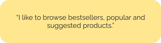

Q: What features of your online shopping experience do you particularly like or dislike?

Q: What information do you seek when purchasing pet treats or food?

Interestingly, the interviews included no male participants. When asked why their partners do not purchase treats, some female interviewees reported that their partners consider pet treats non-essential, focusing instead on necessities like pet food and, curiously, toys.


Fetching Shopper Insights
The valuable insights I gathered from interviewing pet owners enabled me to identify two primary shopper groups with their own key objectives: ensuring ingredient transparency for detail-oriented pet owners and reducing the number of clicks needed to complete a purchase, thereby enhancing both user trust and convenience.

Problem
Problem
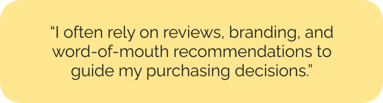
Sarah needs a more streamlined and organised shopping experience to efficiently find and purchase products without the frustration of messy navigation and cluttered layouts.
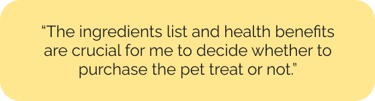
Irene needs access to transparent, clear ingredient information to ensure she is purchasing high-quality and suitable treats for her dog.
Solution
Solution
Create a more intuitive shopping flow and include fun visuals to keep Sarah engaged and minimise her shopping frustrations.
Provide detailed pet product descriptions and clear information about the ingredients used to Irene, assuring her that the pet treats are made from high-quality, natural ingredients.
Speedy Shopper Sarah
Ingredient Inspector Irene
The Redesign Process
Card sorting of the products
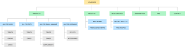
Firstly, I conducted a virtual card sorting session with three pet owners to determine the optimal grouping for Feed My Paws's diverse range of treats, which cater to various pet types and treat categories. This helped me understand which pet treat categories should stay, be relocated, or be combined based on the pet owners' mental models for finding treats online. This exercise was crucial in shaping the organisation of the product menu within the global navigation.
Overhauling the site's information architecture
I reorganised the global navigation to streamline how pet treats, shop info, and resources were categorised. While the concept focused on dog treats, the structure was designed with all pet types in mind to ensure a holistic approach. The information architecture was significantly simplified, thereby enhancing usability and improving access.
Re-creating the brand's identity
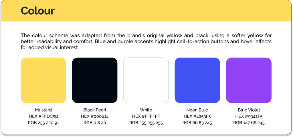
Lastly, I leveraged Feed My Paws’ distinctive yellow and black palette, drawing inspiration from Irvins, to convey a playful warning about the treats' irresistible addictiveness. The new logo incorporates a dog, cat, rabbit, and hamster within the brand name. This design highlights the brand's commitment to various pets while creating a cheerful and engaging identity.


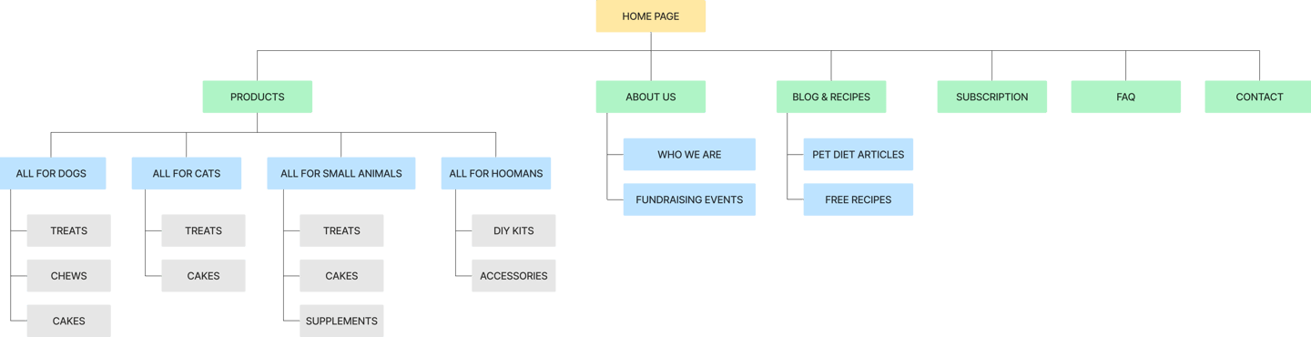
Revising the website's hierarchy and reducing overlapping categories to make content more discoverable
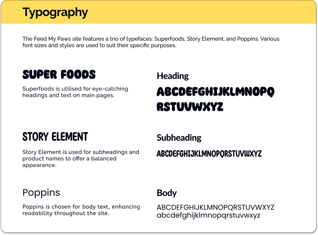
Creating a Fun Design System

The Shopping Journey
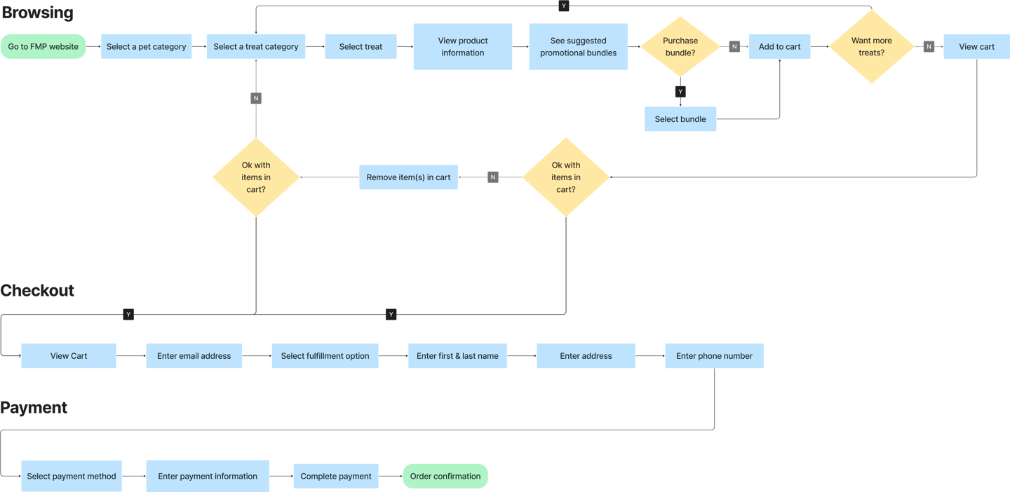
I visualised the shopping journey by creating a user flow that maps key touchpoints, illustrating how pet owners navigate the shopping experience.
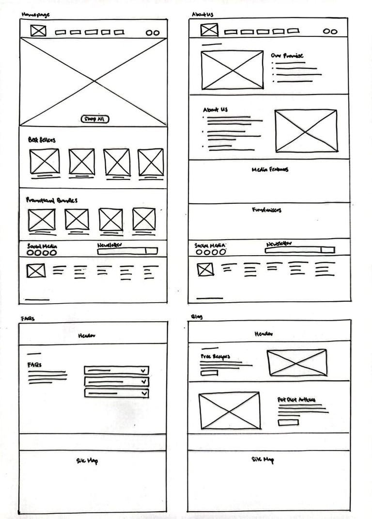
Ideas Baking in the Sketchbook
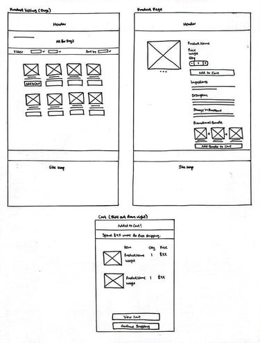
Sketches of early mockups

From Draft to Craft


Before
After
Before
After
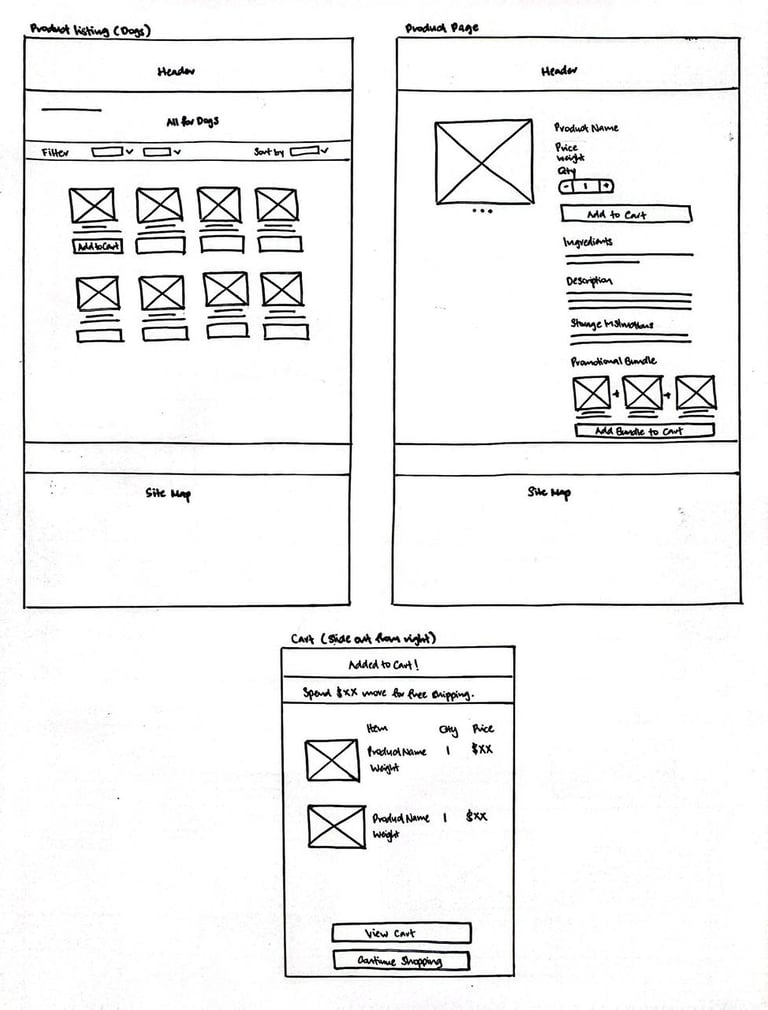
Home Screen
Product Listing
This project marked my first foray into UI design, challenging my abilities and pushing my boundaries. With no prior design background, I began cautiously, initially mirroring the conventional layouts typical of existing pet product shopping sites. However, as I became more proficient with the design tools and processes, I iteratively refined the user interface, each version gradually evolving into a unique expression of my vision.
The significant turning point came when I dared to depart from the conventional path. In my final iteration, I adopted bold visuals, moving elements and large text, aiming to create a fun and engaging experience that distinguished itself from most e-commerce sites.

First version of the prototype
Testing with Pet Owners
Confusion regarding mini treat packs
During the card sorting phase, participants initially viewed mini treat packs as a distinct category. However, usability testing revealed a different mental model, as some participants had difficulty locating the mini treat packs. They suggested grouping them into the corresponding larger pack product pages rather than listing them as a standalone category in the global navigation menu for easier discovery.

Minor UI Changes
All participants enjoyed the new dynamic design elements on the revamped website. The moving text on the home screen and the hover effects on product listings were standout features, highly praised for their playful touch. While some found the font size slightly too large, they appreciated the bold visuals. Based on this feedback, I adjusted the font size to improve readability.
Usability testing was carried out with five users and garnered overwhelmingly positive feedback. All users successfully completed their tasks, achieving a median System Usability Scale (SUS) score of 87.5.
Feedback on the site's navigation and organisation was consistently positive, with users highlighting the ease of browsing, adding items to the cart, and completing checkout. Although the overall experience was smooth, I spotted small areas for improvement and made iterative refinements to strengthen clarity and usability.

Afterthoughts 💬
This conceptual redesign of the Feed My Paws website was a delightful passion project for me. It gave me the opportunity to connect with other pet lovers through social media for user interviews, helping me build new friendships along the way. I developed two complete versions of the prototype, both warmly received by pet owners for their engaging visuals and friendly vibes. My primary challenge was being new to UI design; nevertheless, I experienced substantial growth through this project, learning to push the boundaries of design while enjoying the process.
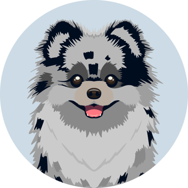
I share my life with a Pomeranian who is absolutely convinced the world revolves around him (honestly, he’s not wrong).
If you're a fellow designer or dog-lover, we already have something in common. If you're neither, I'm sure we’ll still find something to geek out over. Either way, feel free to reach out if you’d like to chat, share ideas, or build something together.