Mobile@HDB
Enhancing residents’ experience through easy access to essential residential services and personalised updates
Singaporeans are frustrated with the current Mobile@HDB app, which primarily redirects users to an in-app browser and suffers from disorganised content. In this concept project, we focused on identifying and integrating essential services and features that matter most to Singaporeans, rather than attempting to include everything HDB has to offer.
Through user interviews, we uncovered pain points and preferred use cases, which guided us in redesigning the app around key services with a streamlined interface. Our design not only simplifies access to vital functions but also sets the stage for future expansions, ensuring the app can evolve as more services are added.
Revamping the HDB Mobile Experience
30-Second Summary
The Housing & Development Board (HDB) is Singapore’s public housing authority, serving over 80% of the population. While it offers a wide range of digital services through platforms like HDB InfoWEB, My HDBPage, and the HDB Flat Portal, the sheer volume of content has led to a cluttered and disorganised navigation experience on the Mobile@HDB app.
Users struggle to find the services and information they need efficiently, making the app frustrating and difficult to use. Over time, the app has become a dumping ground for links that mostly redirect users to the website. In this project, we conducted in-depth research, developed a product strategy, and redesigned the Mobile@HDB experience to simplify access to essential services and improve usability for Singaporeans.
HDB's Vast Digital Ecosystem: A Problem in Itself
About
What Other Giants are Doing
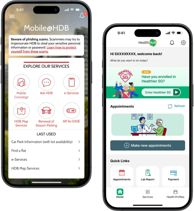
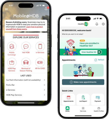
Mobile@HDB: Links under "Explore Our Services" may not be useful for most users. The app looks dated.
HealthHub: Users can view personalised appointment details and important quick links on the home screen.
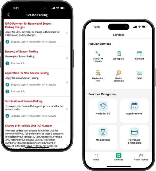
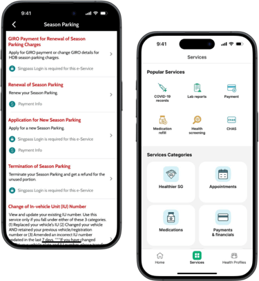
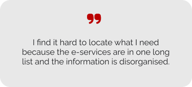
Mobile@HDB: Finding relevant services is difficult because each e-services section shows a lengthy list of up to 32 options per page.
HealthHub: Easy to navigate health services and programmes due to clean layout and well-organised categories.
Firstly, the team conducted a comprehensive market analysis against other prominent industry players (e.g. DBS Digibank, PropertyGuru) and government applications (e.g. SingPass, HealthHub, CPF Mobile). We evaluated critical aspects such as functionality, user interface and user feedback to pinpoint areas for strategic improvements.
What Users are Saying
We interviewed 38 Singaporeans (aged 18 to 44) who had recently used the HDB website or mobile app.
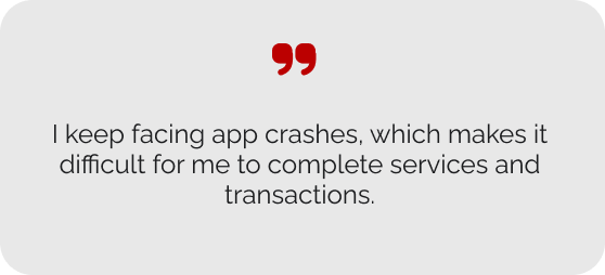
We also examined user reviews on the App Store and Google Play, noting that the top concerns raised included the following:
During the in-depth interviews, we identified the following key pain points experienced by current users:
User Interviews
App ratings and reviews
Who We Are Designing For
Drawing from the extensive insights gathered from our interviews, we identified the most prominent issues, leading to the development of personas representing HDB’s top three user groups: BTO flat buyers, season parking users, and prospective homebuyers. We then pinpointed each persona’s most critical pain point and brainstormed targeted solutions to address their specific needs.
Solution
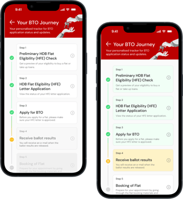
Introduce an interactive BTO roadmap with a timeline, progress bar, notifications, and previews of important information and required documents for each step.
Problem
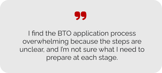
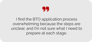
Mason & Betty need a better way to track their BTO application because they feel overwhelmed and uncertain without step-by-step guidance on the application process and documentation requirements.
Problem
Problem
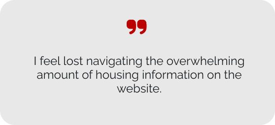
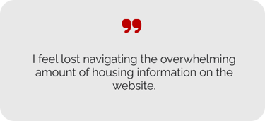
Jen needs a better way to access homebuyer information because the fragmented information on HDB's website and in-app browser hinder her ability to gather essential information efficiently.
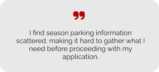
Peter needs a better way to access season parking information and e-services because the current website or mobile app is not intuitive to navigate.
Solution
Solution
Create a homebuyer's guide with a bookmarking function and personalised financial calculators to estimate housing payments and loans.
Create a unified page for car park information and e-services, allowing users to submit season parking applications and access detailed parking options seamlessly.
Mason & Betty Oh
Build-to-Order Flat Buyers
Jen Zee
Prospective Homebuyer
Peter Parker
Season Parking User
Design Considerations
One of the most challenging aspects was balancing the desire for a comprehensive feature set with the need for a clean and intuitive interface. I conducted a detailed review of the entire HDB website to understand its full range of information and services, methodically outlining its sitemap to streamline planning. Through multiple discussions and design iterations, we made difficult decisions on which features to prioritise, simplify, or remove. Our focus remained on delivering maximum value by addressing key user needs while avoiding feature overload to ensure a seamless and uncluttered user experience.
During our user interviews, opinions were divided on including information for residential and car park services in the Mobile@HDB app. Some users preferred direct access within the app, while others found it redundant and preferred using the website or mobile browser. Maintaining information on both platforms could complicate content management, increase costs, and make frequent updates more challenging. Despite these concerns, we included an information section in our initial prototype to evaluate its usefulness through usability testing.
Balancing Functionality & Simplicity
Trade-off between Convenience & Content Management
Building a cohesive design system
To improve on the Mobile@HDB app’s dated, text-heavy design, we introduced simple icons for each e-service and added illustrations at key touchpoints, creating a more visually engaging and user-friendly interface.
Firstly, we created a new logo for the mobile app that reflects the iconic HDB buildings, maintaining the original brand colors of red and white. However, we used a more modern shade of red and minimised the number of typefaces and fonts used for a cleaner UI.
We developed a design system that enhanced the app’s visual appeal while staying true to HDB’s brand identity. By incorporating design elements inspired by HDB’s architectural features and closely aligning with the existing colour palette, we modernised the app’s look while maintaining a sense of familiarity and trust.
Building in the Works
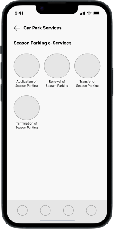
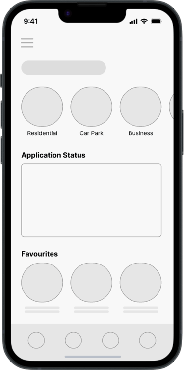
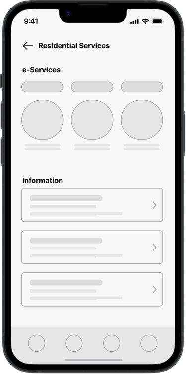
In our early wireframes, we prioritised core features that needed to be easily accessible from the home screen, ensuring users could reach essential services with minimal effort. We made key design decisions for the main pages’ user interface, focusing on a clean and intuitive layout. Dedicated sections were created for e-services and information, simplifying navigation while keeping the app organised and user-centric.
Build, Test, Repeat
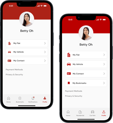
Navigation Bar Optimisation
Some users went to their profile to find bookmarked pages, as they were accustomed to doing in shopping apps. Others mentioned that icons for the main residential and car park pages were more important since they needed them more frequently. Based on this feedback, we shifted the bookmarks to the user profile, notifications to the main dashboard, and replaced the navigation bar icons with “Residential” and “Car Park”.
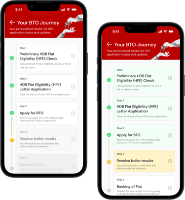
BTO Journey Card Update
Some users didn't realise the greyed-out cards in the BTO Journey were clickable, assuming they were disabled due to the colour. To address this, we updated the card colours to enhance visualisation of progress. The greyed-out cards were replaced with white ones, signalling to users that they could click on upcoming steps for more details, completed steps were coloured green, and the current step was coloured yellow.
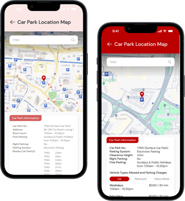
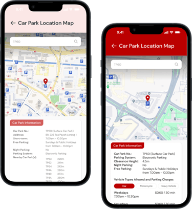
Enhanced Map Interactivity
77.8% of users found the original car park location map lacking. They wanted to view nearby car parks, click on parking icons to display information for other car parks, and have short-term parking charges included. To address this, we updated the map to allow tapping on individual car park icons for detailed information and included parking charges in the car park information section.
The initial prototype was tested with 12 participants, including BTO flat buyers, season parking users, and prospective homebuyers. Most participants successfully completed all 17 assigned tasks, achieving an average System Usability Scale (SUS) score of 82.7. Feedback was overwhelmingly positive, with participants noting significant improvements over the current version. We also gathered valuable insights to further refine the prototype, ensuring better alignment with user behaviours and expectations.
The MVP
Future Developments
Enhance user satisfaction and engagement by optimising current functionalities through incremental innovations, such as refining user interface elements based on the Singapore Government Design System guidelines.
Incorporate advanced technologies for transformational innovations, such as AI for personalised housing advice and AR for virtual property tours.
Expand the app’s capabilities by introducing additional financial tools and the Resale Flat Listing (RFL) service, and extend the application to other devices, such as tablets, to increase accessibility.
Short Term
Long Term
Mid Term


Afterthoughts 💬
Reflecting on user insights from initial interviews, half of the participants expressed that an information section in the Mobile@HDB app would be redundant since they could access information directly through the website or mobile browser. Additionally, taking cues from successful applications like SingPass and CPF Mobile, which effectively support Singaporeans with essential services and transactions, I recognise the value in keeping the app focused and uncluttered. Consequently, I would further evaluate whether users actually engage with the information section. Otherwise, removing it would streamline content management and reduce the complexity and costs from maintaining parallel updates across both the app and website.

