Transforming conversations into trusted AI summaries

SCRIBE | OPEN GOVERNMENT PRODUCTS
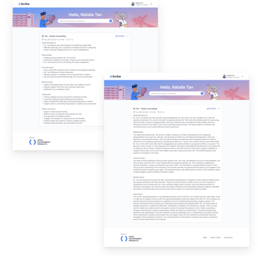
A transcription and summarisation tool that helps transform conversations into structured notes.
ABOUT SCRIBE

MY ROLE
User Research, Wireframing, Prototyping, Concept Testing, User Interface Design, Product Strategy, Stakeholder Management
THE TEAM
6 people in total, 3-4 at any one time, 1 Product Designer, 1.5 Engineers, 1 Product Operations Specialist
YEAR
2025
TIME FRAME
4 months

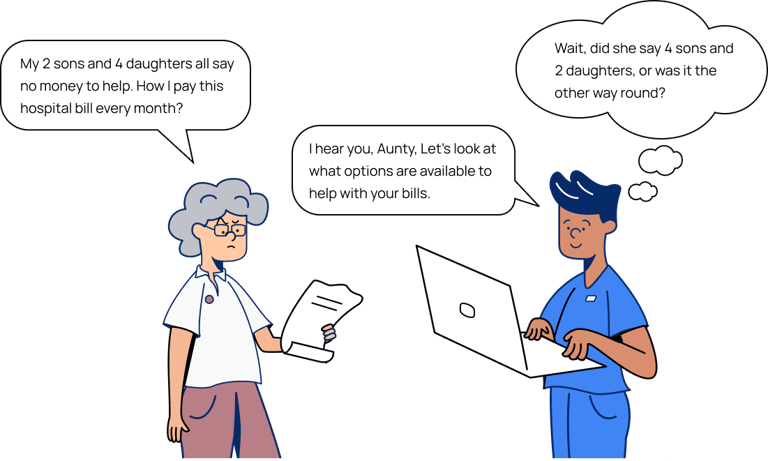
For professionals like social workers and healthcare practitioners, documentation is a critical (but often burdensome) part of the job. It is especially challenging when they are expected to capture accurate, detailed notes while navigating emotionally intense or complex conversations with clients or patients.
In Singapore, this challenge is compounded by the way people naturally switch between languages and use Singlish — a reality that existing transcription or summarisation tools aren’t built to handle. Most struggle with accuracy, making them unsuitable for local practice.
PROBLEM DISCOVERY

Born out of Hack for Public Good in 2024, Scribe was built to ease the mental load of documentation, helping medical social workers stay fully present in emotionally demanding conversations while ensuring accurate records are captured for their casework.
SCRIBE'S ORIGIN
MY CONTRIBUTION
When I joined the team in March 2025, I started by shadowing medical social workers in their day-to-day work, to understand how Scribe fit into their workflows and where friction remained.
As we began expanding Scribe to more agencies and user roles, I conducted check-ins and user interviews to uncover gaps in the product, and facilitated training sessions for new users coming onboard. These sessions became an important way for us to quickly build relationships with our stakeholders and understand their concerns surrounding Scribe.
From these ongoing interactions, I helped the team make sense of the many issues and feature requests that surfaced — sharing back key insights so we could prioritise which problems to solve first. Subsequently, I designed and tested concepts with users, ensuring our solutions were practical and grounded in their day-to-day realities.
IMPACT
As of June 2025, less than a year after Scribe's launch to all public hospitals and 68 Social Service Agencies, we achieved...
16,853 hours
61.9 %
3.86 / 5
Total documentation time saved
Documentation time saved per session
Usefulness of summary
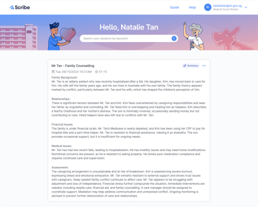
HOW SCRIBE WORKS
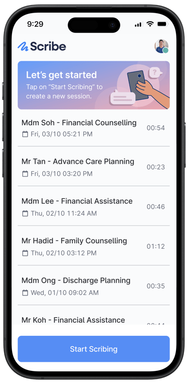
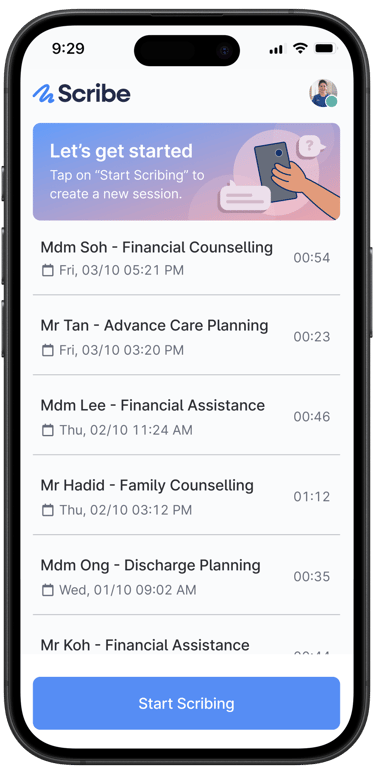
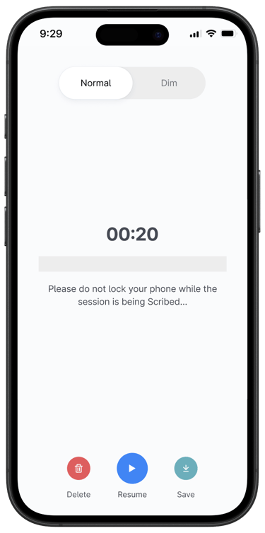
Step 1: A typical Scribe session begins with the user starting a recording on their mobile device before a client or patient interaction.
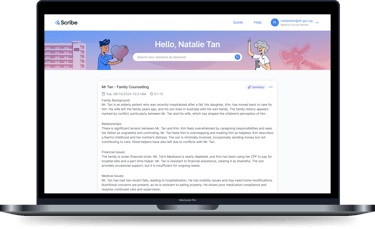
Step 2: After the conversation, the user accesses the Scribe web platform on their computer, where the recorded session is automatically available.
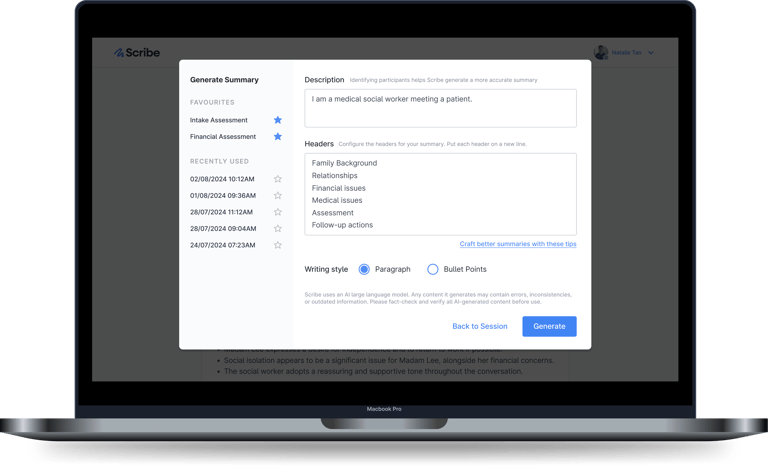
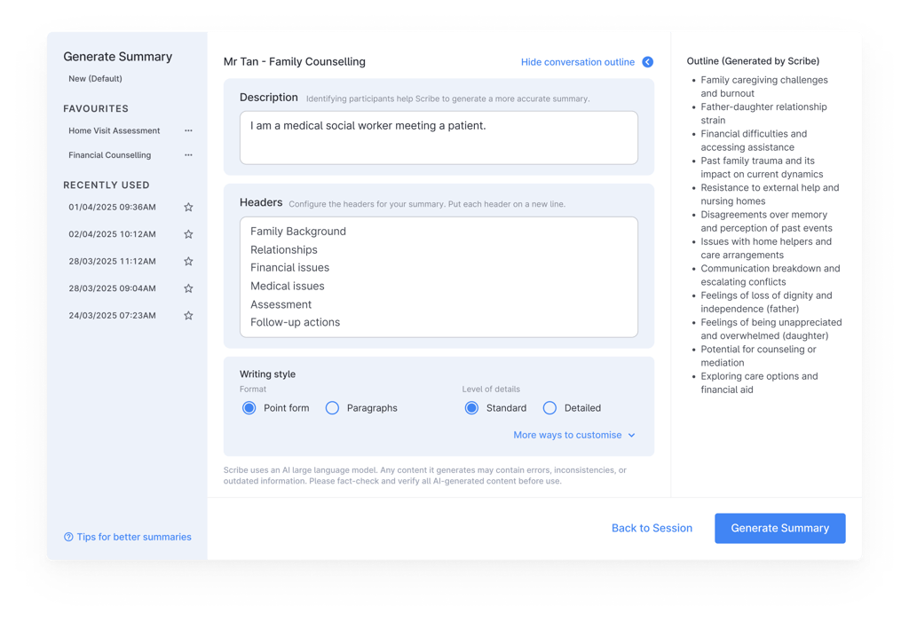
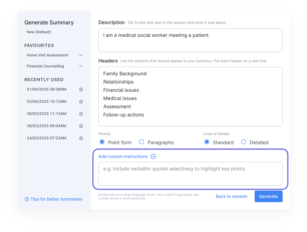
Step 3: The user selects the session and generates a summary by providing a short description and crafting summary headers.
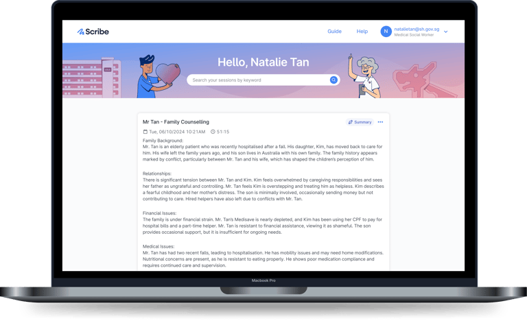
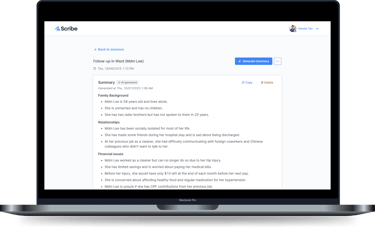
Step 4: The user views the generated summary, and can either regenerate another if needed or copy it out to their documentation system.


Scribe was still an early product with many pain points and feature requests from users. Our challenge was to evolve the product thoughtfully — adding value without compromising the simplicity that made it useful in the first place.
To focus our efforts, I shared insights gathered from our users to help the team assess each pain point and request through three lenses:
How frequently the feedback surfaced across users
How well it aligned with Scribe’s core purpose of simplifying documentation
How it would affect usability
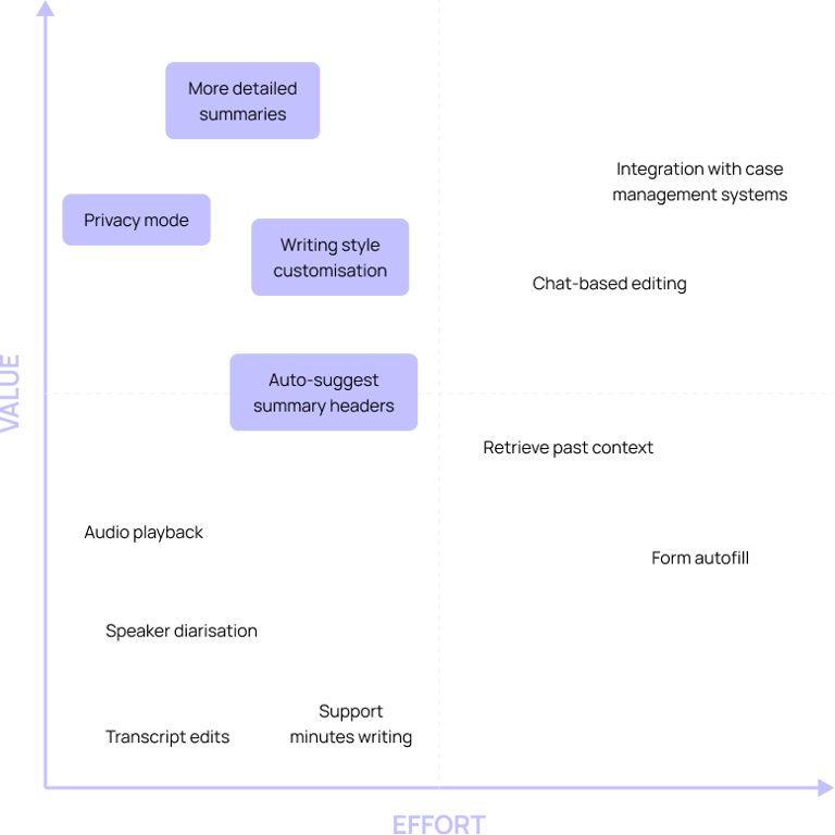
These insights guided our prioritisation discussions, ensuring we focused on features that delivered the most value without adding unnecessary complexity. I also mapped ideas on a Value vs Effort matrix to visualise trade-offs and sharpen our focus on improvements that offered high user benefit for reasonable implementation effort.
FEATURE PRIORITISATION

OUR FOCUS
The matrix helped us align on where to start. We decided to focus on four high-impact problems that could be addressed quickly and would likely make a meaningful difference to users:
Difficulty crafting summary headers
Summaries that were too concise
Misalignment with users’ writing style
Discomfort with the visible recording UI
Problem #1: Difficulty crafting summary headers
THE PROBLEM

15 %
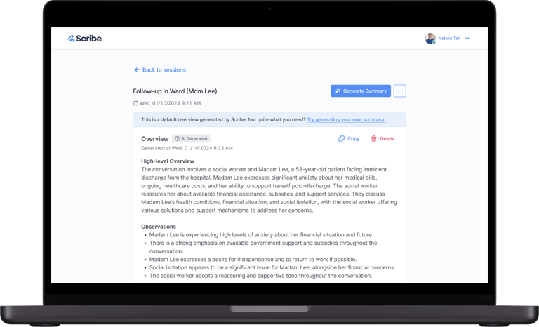
While the initial conversation outline helped users recall key topics, we thought it could go further. What if we could give them something more complete, without any extra effort on their part? That idea became the default overview — a concise, pre-formatted summary generated once a session has been transcribed, capturing the essence of the conversation and giving users a clear starting point for their documentation.
I started by exploring how Scribe could help users generate better headers for their summaries. Using prompts in Scribe’s backend model, I tested an early concept where Scribe would automatically suggest headers based on the conversation. Users could regenerate different sets of headers until they found one that fit their needs.
Scribe relies on user-provided headers to generate summaries, but after long or emotionally intense sessions, users often struggled to remember enough detail to craft them. In these moments, recall became a barrier — leading some users to ask if Scribe could suggest headers for them.
THE FIRST CONCEPT
THE SOLUTION
THE OUTCOME
decrease in sessions with manually generated summaries
The drop suggests that some users found the default overview effective enough on its own. Even for those who went on to create custom summaries, many told us it saved them time, as they no longer had to replay conversations in their heads just to decide on the right headers.
“The instant overview is amazing. Previously, I had to think about what kind of headers to use for each case. Now, I can refer to the topics generated in the default overview and use those to help craft my summary headers.”

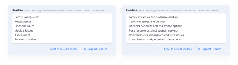

However, user testing indicated that the suggested headers often didn’t align with what users would normally input themselves. They also found the interaction cumbersome, since they had to copy and mix headers manually from each regenerated set.
Concurrently, I explored a second concept — a conversation outline panel that presented a quick overview of key topics discussed. The panel was designed to stay collapsed by default to avoid visual clutter, allowing them to slide it out only when they needed to help recall the conversation.
THE SECOND CONCEPT
Users found the conversation outline more helpful for crafting their headers, as it supported recall without adding extra steps to their workflow.
"When I can finally start writing my case notes at the end of the day, it's difficult to recall enough details to write good headers."
Problem #2: Summaries are often too concise
THE PROBLEM
66 %
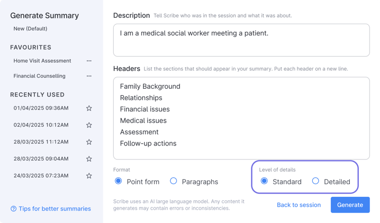
Summary length was initially limited by the model’s token cap — this helped reduce hallucinations but also restricted how much detail could be captured.
I worked with our engineer to experiment with different backend prompts, adjusting how much information the model was asked to include. Using a social work case study, we generated several summaries of varying lengths and tested them with users to understand what level of detail felt “just right.”
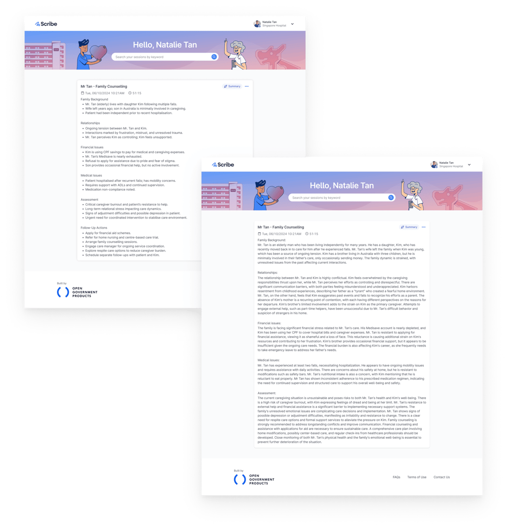
Some sessions require concise notes so that other team members can quickly grasp the key points without reading lengthy text. In other cases, more detail is needed to capture important nuances, such as the patient’s family composition or sequence of events. Many users shared that Scribe’s summaries were often too brief, omitting these details and requiring extra time to edit or fill in the gaps.
THE PROCESS
THE SOLUTION
THE OUTCOME
of summaries were generated with the detailed option
This highlighted users’ preference for richer summaries and showed that documentation in health and social care often requires more depth than what Scribe could initially provide.
“With the detailed option, it does capture quite a bit more information and cut down on admin time.”
We introduced a set of radiobuttons that allows users to choose between “Standard” and “Detailed” summaries to better fit the needs of each session, without adding complexity to the interface.
“Sometimes the summary just says the patient has siblings, but I need to record the family composition — eldest is daughter, second is son, and so on.”
Problem #3: Misalignment with users’ writing style
THE PROBLEM

11 %
Scribe was designed to work out of the box, without users needing to write raw prompts. However, some experienced users discovered they could “hack” Scribe by adding prompts in the description or headers fields. Since there was no affordance suggesting this behaviour, most users never realised custom prompting was possible.
Meanwhile, others had no interest in crafting prompts at all and were comfortable using Scribe as-is. This pointed to a need for an optional prompt field that wouldn’t overwhelm the interface.
Scribe’s summaries often didn’t reflect users’ usual writing style — from shorthand like “pt” for “patient,” to preferred tenses and use of verbatim quotes. This mismatch led to additional time spent revising the output.
WHAT I FOUND OUT
THE SOLUTION
THE OUTCOME
of users used custom instructions before
Adoption of the feature was lower than expected. In later user engagements, we found that many didn’t realise the feature existed, as it was tucked away in a collapsible section.
To address this, we made it permanently visible in the interface. We’re continuing to monitor usage and user feedback to understand whether it meaningfully supports users, and will consider changing or retiring the feature if not.
We introduced an expandable "Add custom instructions" field in the Generate Summary modal. This allows users to optionally provide custom instructions to influence the summary output. To help less savvy users get started, the field includes placeholder text with a lightweight example reflecting a common need — such as quoting clients verbatim.
“I still spend quite a bit of time to restructure or reword the content to match how I would normally write.”
Problem #4: Discomfort with the visible recording UI
THE PROBLEM

30 %
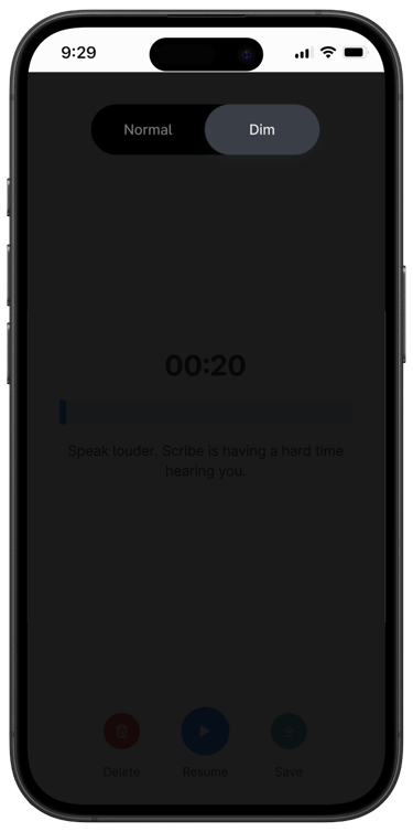
Some users shared that the visible recording interface made clients more self-conscious during sensitive conversations, affecting the comfort and openness of the session. While consent is always obtained before recording, the interface needed to be less visually intrusive to support more natural, trusting interactions.
THE SOLUTION
THE OUTCOME
of users used Dim mode
To reduce visual distraction during sessions, we introduced a Dim Screen mode that darkens the recording interface. It keeps the recording indicator visible to practitioners while helping clients feel more at ease in sensitive conversations.
“Sometimes I have clients staring at the timer on the screen while it's recording.”

AFTERTHOUGHTS
Scribe reminded me that restraint is part of good design. As we expand Scribe to support more user groups, it is tempting to address every need with a new feature. But layering on too much complexity risks turning a helpful tool into a burdensome one, ultimately leading to user drop-off.
Our deep research helped us distinguish common needs from edge cases that didn’t justify the added complexity. This informed our product vision and ensured the roadmap served the majority of users while keeping Scribe focused and easy to use.
I share my life with a Pomeranian who is absolutely convinced the world revolves around him (honestly, he’s not wrong).
If you're a fellow designer or dog-lover, we already have something in common. If you're neither, I'm sure we’ll still find something to geek out over. Either way, feel free to reach out if you’d like to chat, share ideas, or build something together.